
Hi,
Welcome to MinaDesign
Great design is more than appearance; it's effective communication. As a graphic designer, I work closely with my clients to create visual identities that are not only unique and eye-catching but also accurately represent their business's values and mission. Let's work together to create a brand that will make your business stand out in the market. From branding and logo design to publication design, advertising, and illustration, every project is crafted with attention to detail and a focus on quality. Explore my portfolio to see how strategic design can bring your ideas to life.

My services include branding, motion graphics, advertising, publication design, icon design, and illustration.
BRANDING
The collection of logos & brand identities for different clients.
Publication
Variety of different materials such as magazine, storybook, and annual report.
ICON & ILLUSTRATION
Different styles of icon and illustration.
MOTION GRAPHIC
Text & shape motion graphic techniques conducted by After Effects
POSTER DESIGN
Posters designed for a range of events and campaigns.
FEATURED PROJECTS

NEW DESIGN Branding

HelloHero Brand Collateral

allDelivery Branding

Alshagra Branding & Packaging

Poster Design

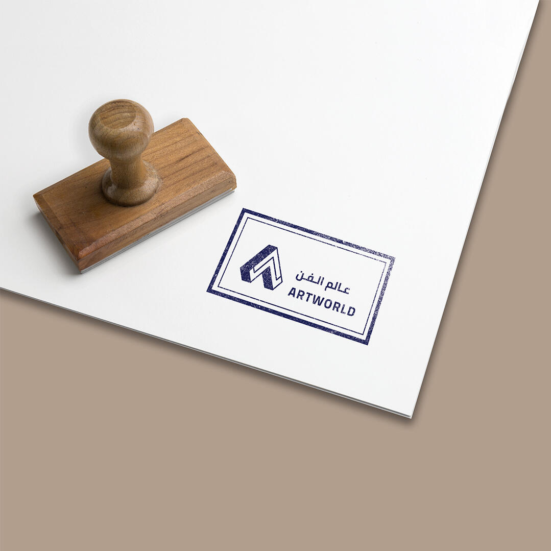
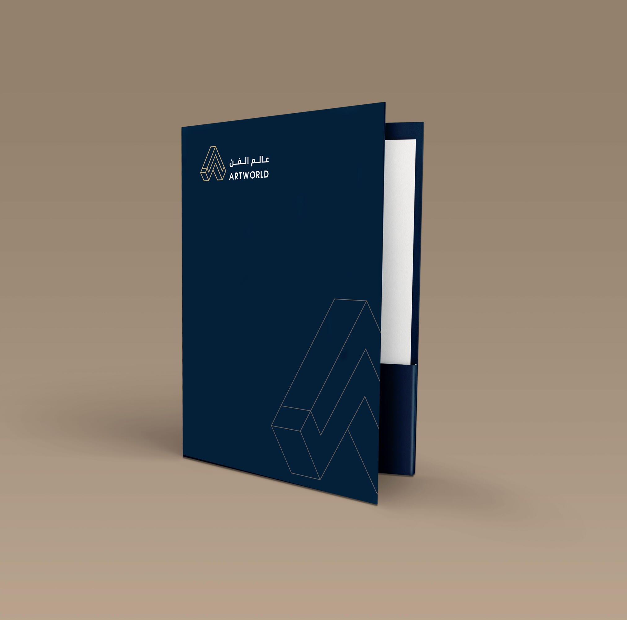
ARTWORLD Branding

Publication

Motion Graphic

Illustration

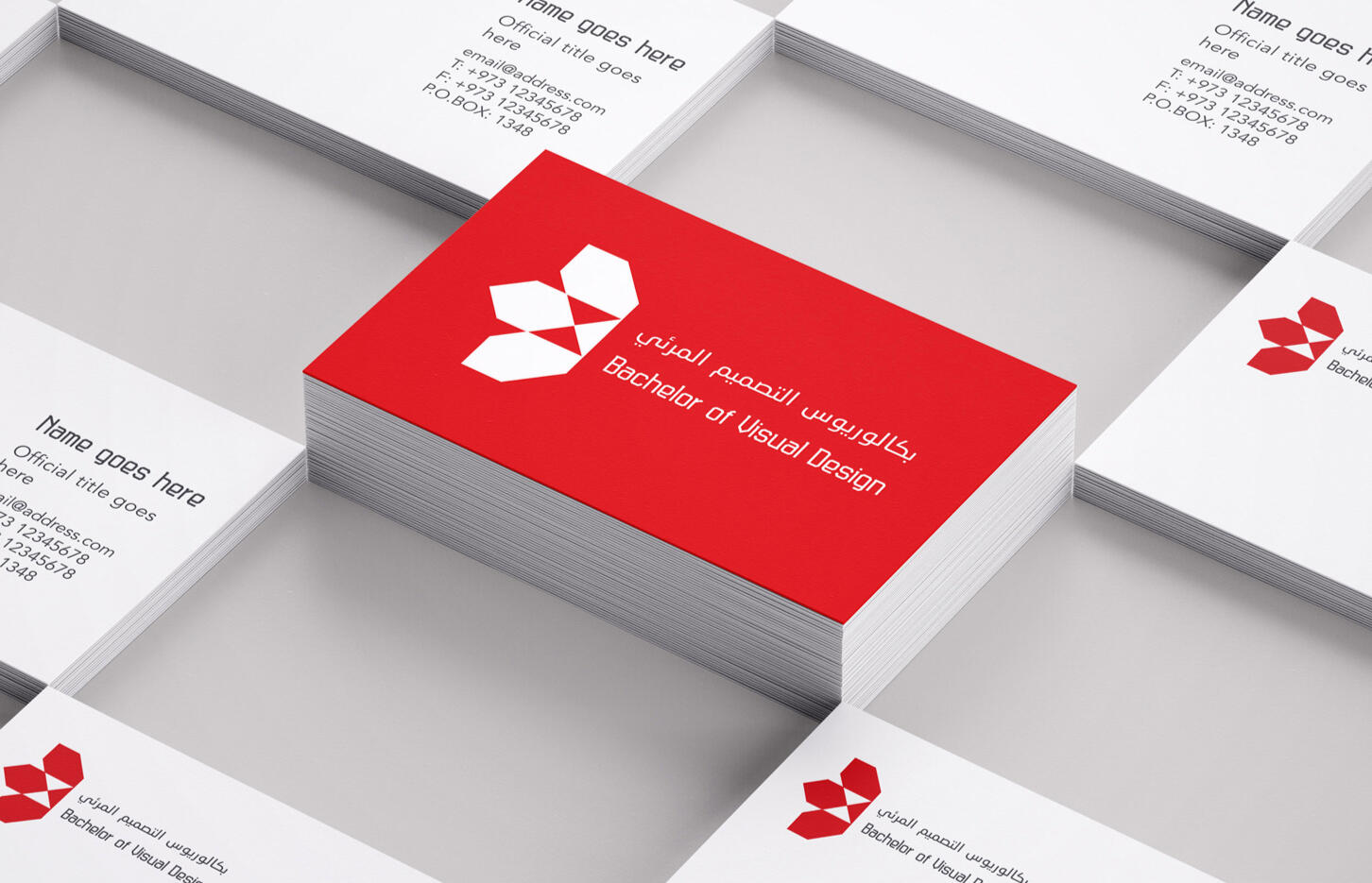
BVIS Branding
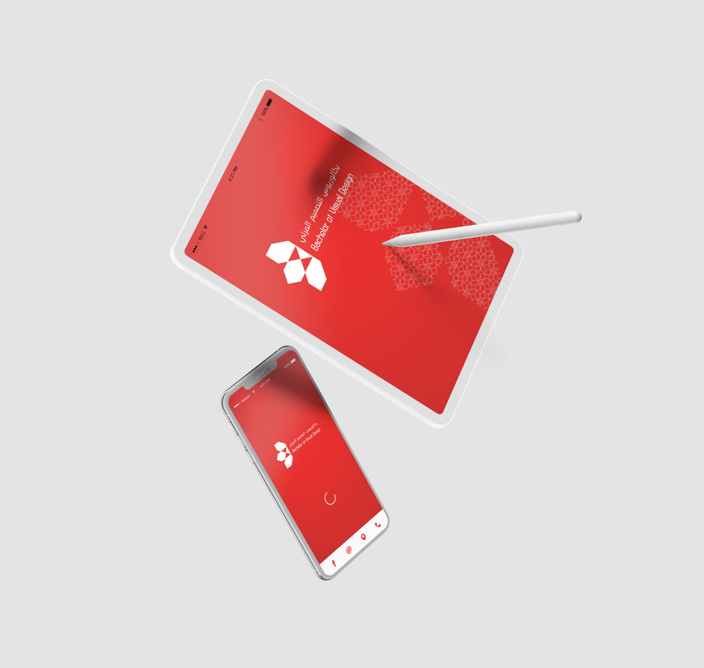
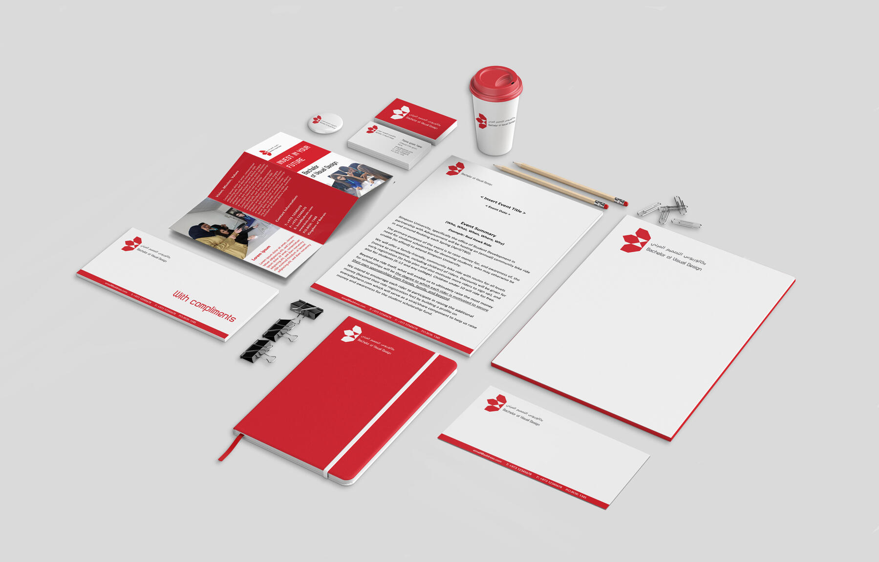
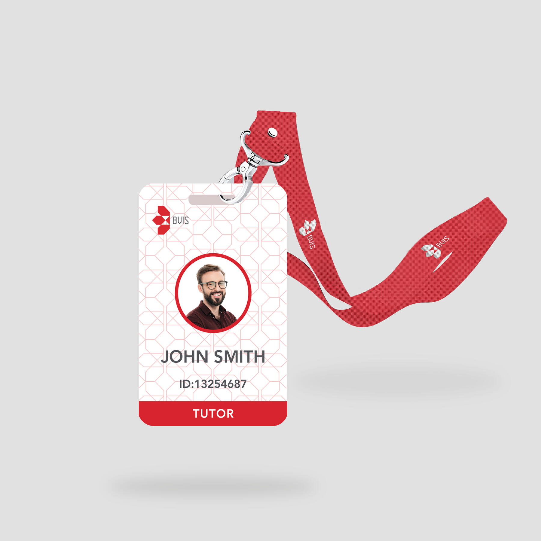
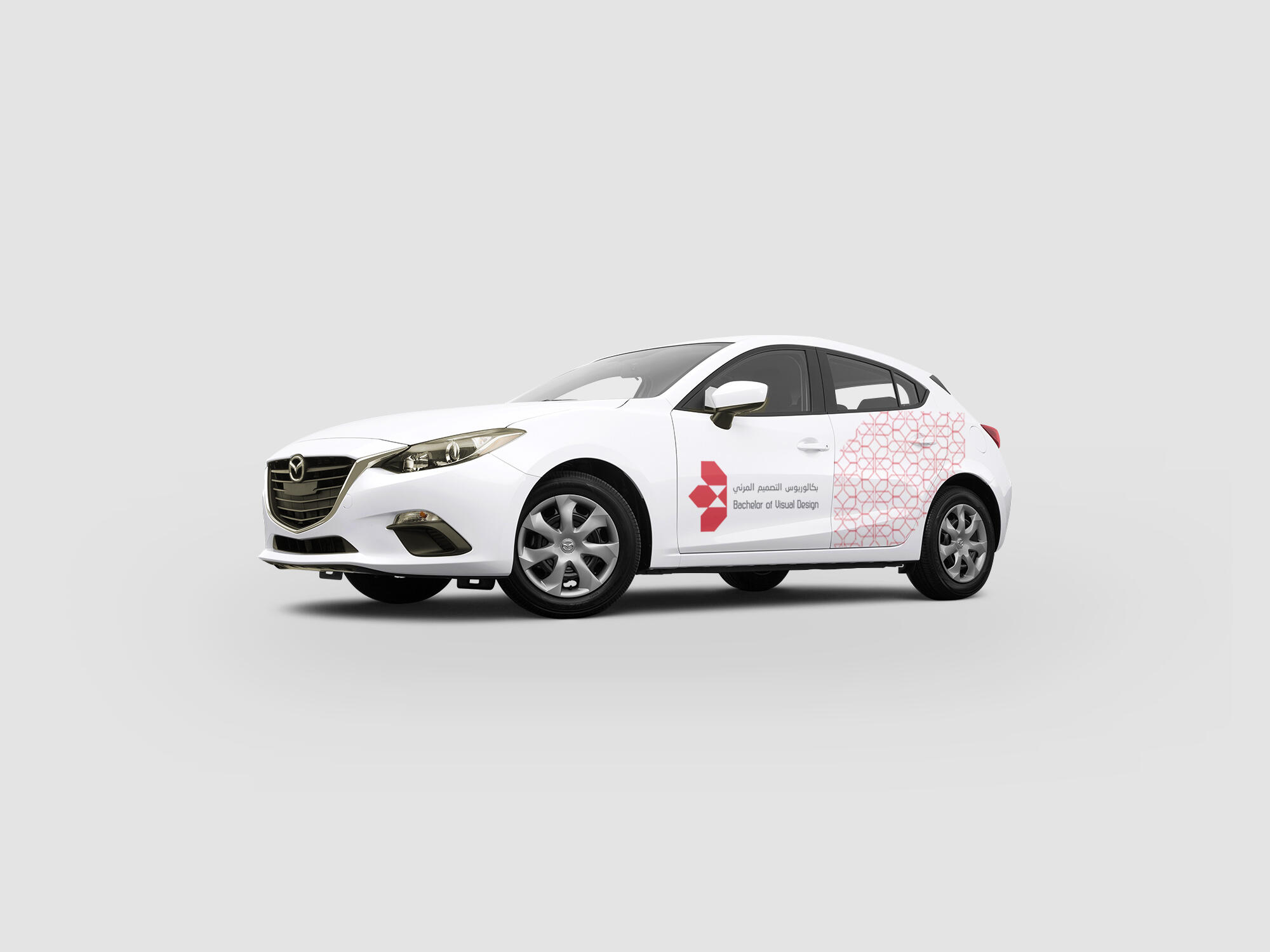
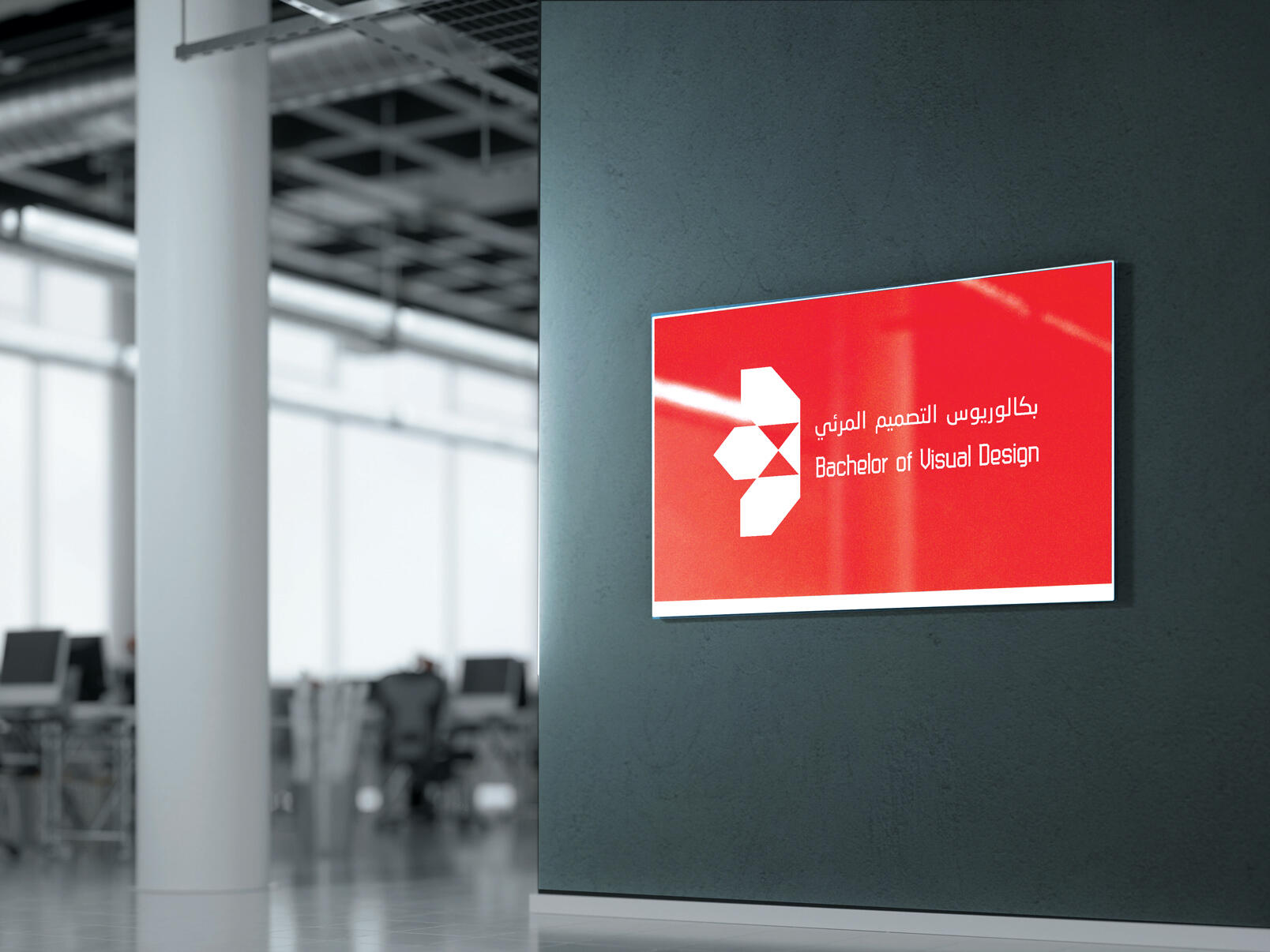
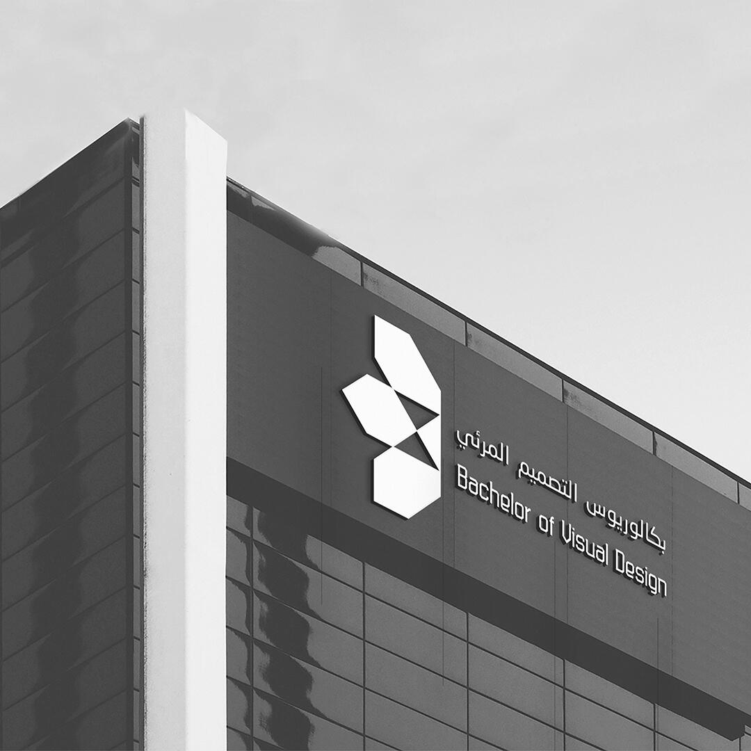
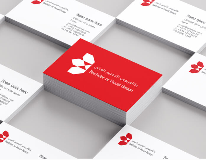
Objective: Creating a comprehensive brand identity for a Bahraini visual design college, to provide guideline for employees, when they are producing materials related to this brand. Examples need to be provided about how the brand elements should be used through different channels of communication.Solution: The logo has two components: the logo and the logotype. It is combination of critical thinking and Bahraini traditional design, both of which are valued by this brand. The logo implies a sense of movement since its components point toward different directions; hence, it conveys the brand’s mission, which is to train skilled students ready to work locally and internationally. The color red applied to imply a sense of power and energy.
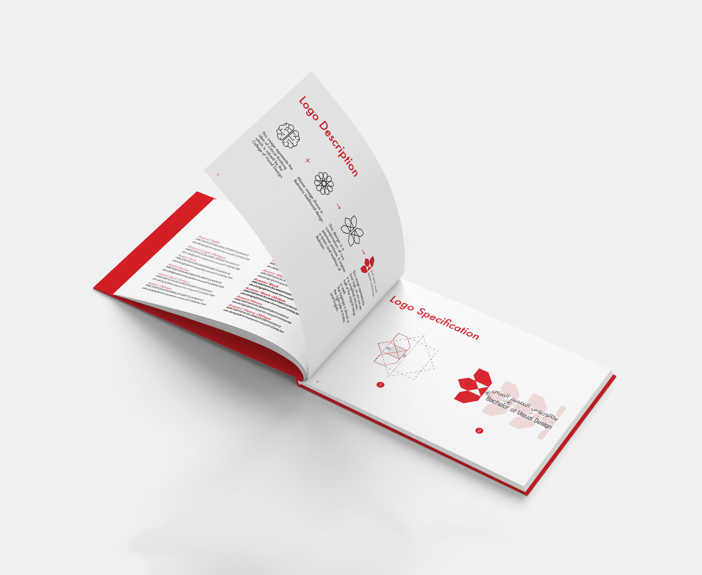
Brand Book: The 70 pages book contain complete guideline of the brand. It includes tone of voice, correct position of the logo, photography rules, internet guide page, signage, car sign, intranet, presentation template, certificate, invoice, pattern and more.

SEE MORE PROJECTS

NEW DESIGN Branding

allDelivery Branding

ARTWORLD Branding

HelloHero Brand Collateral


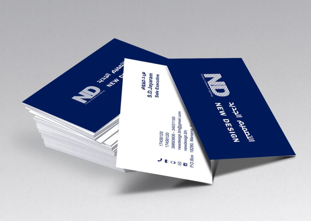
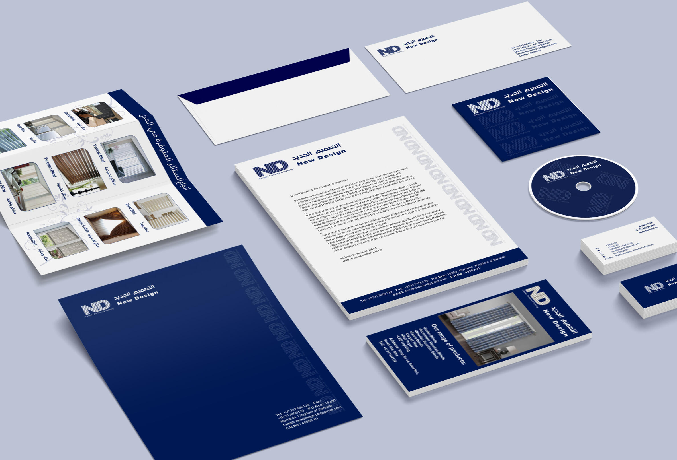
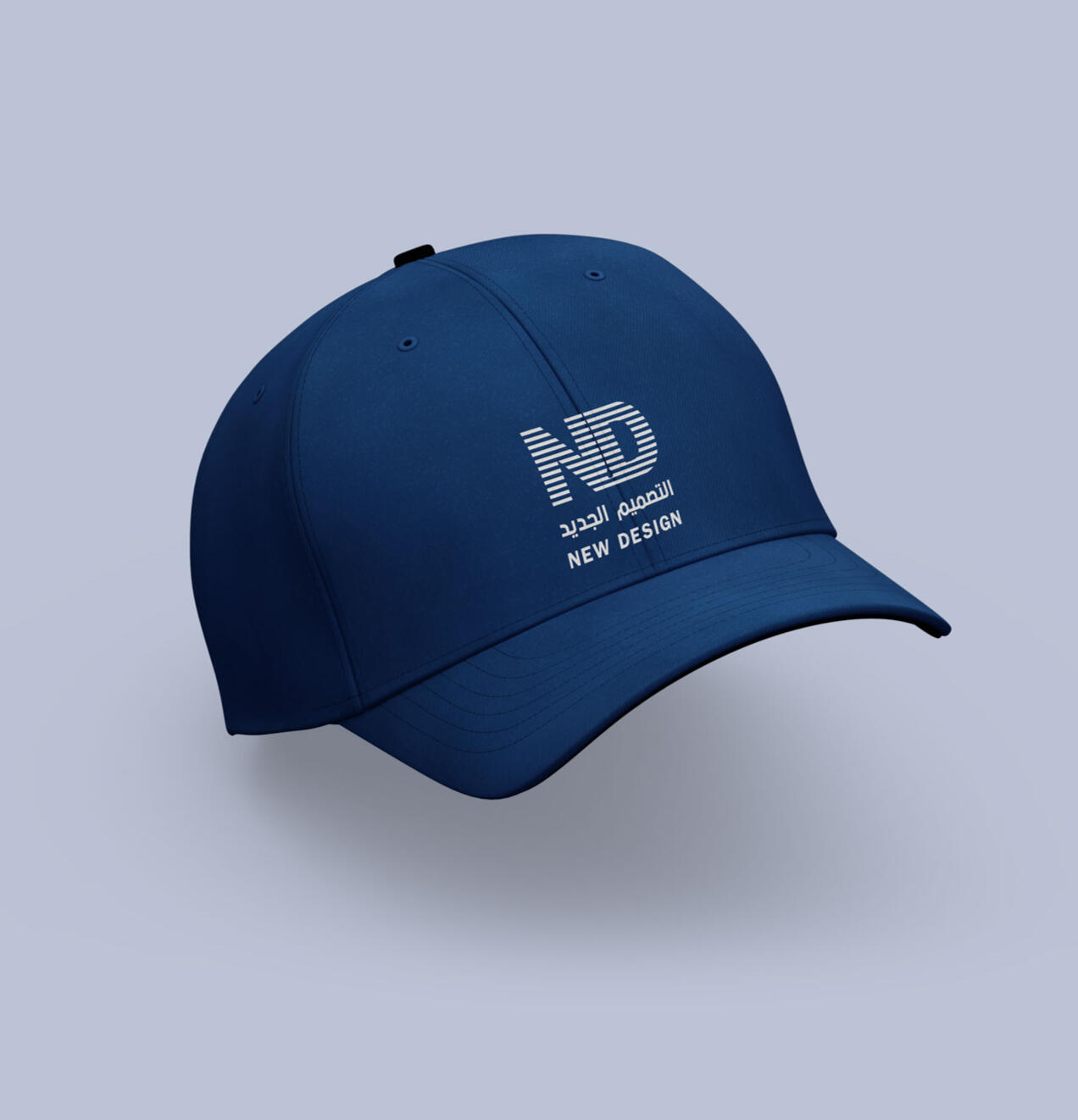
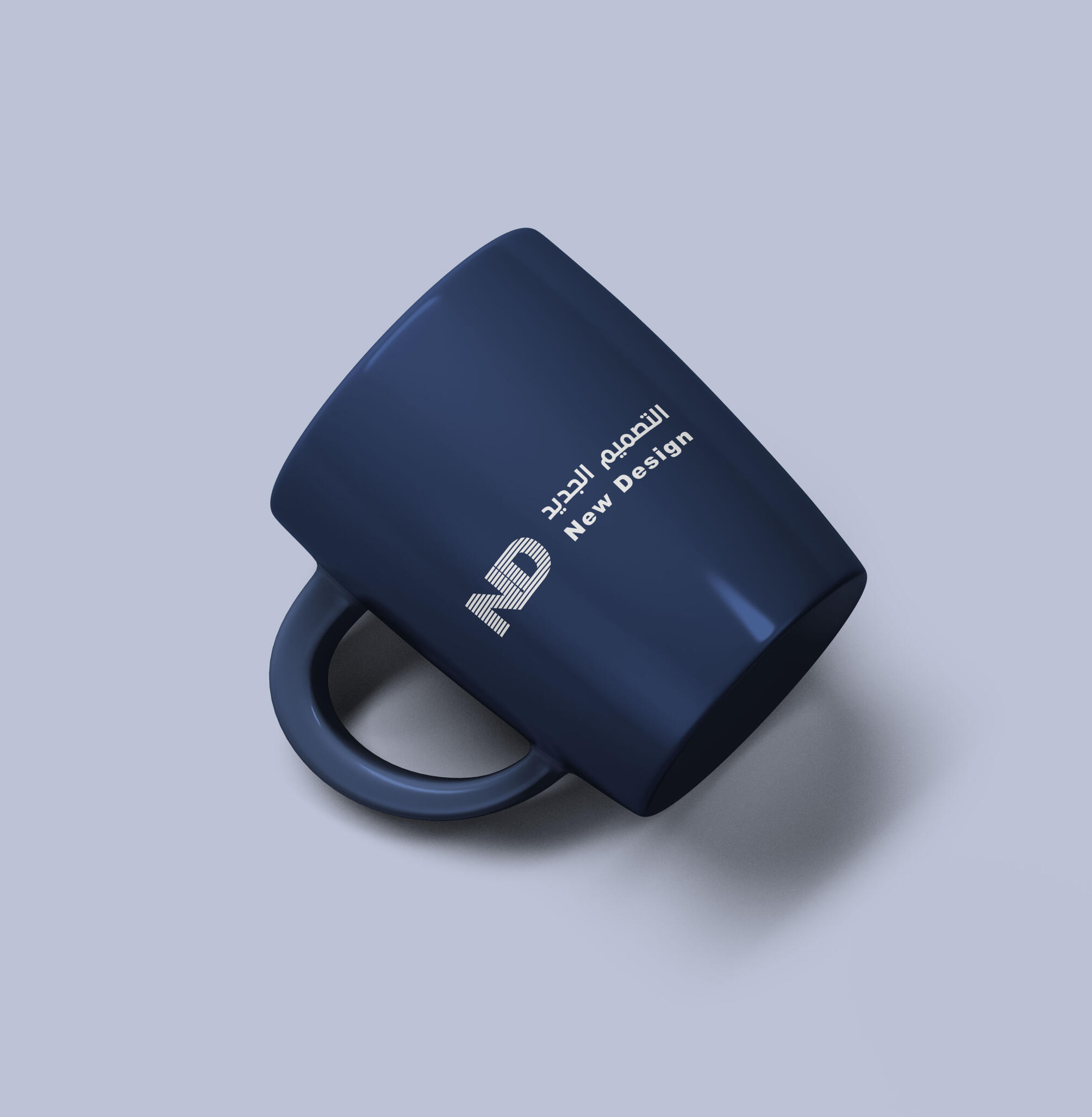
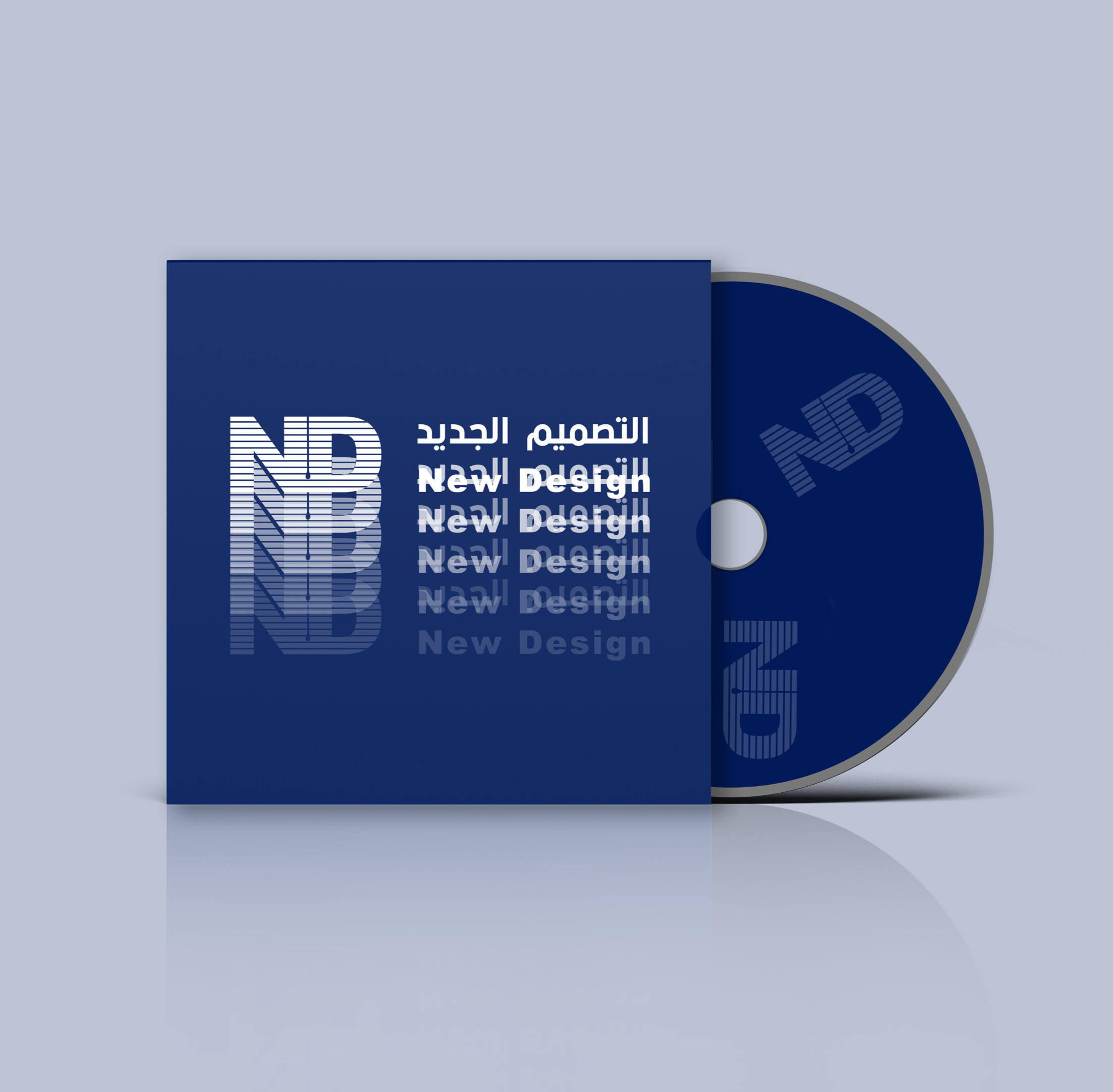
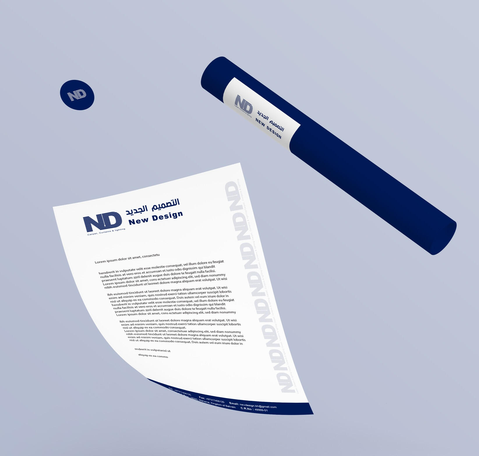
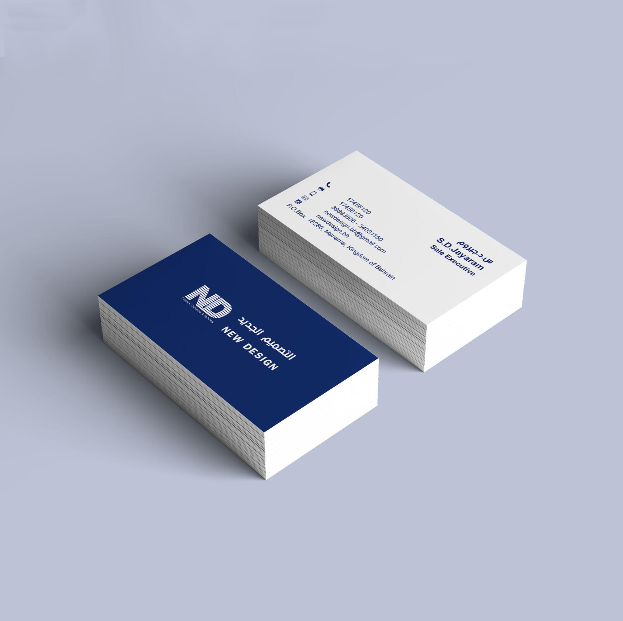
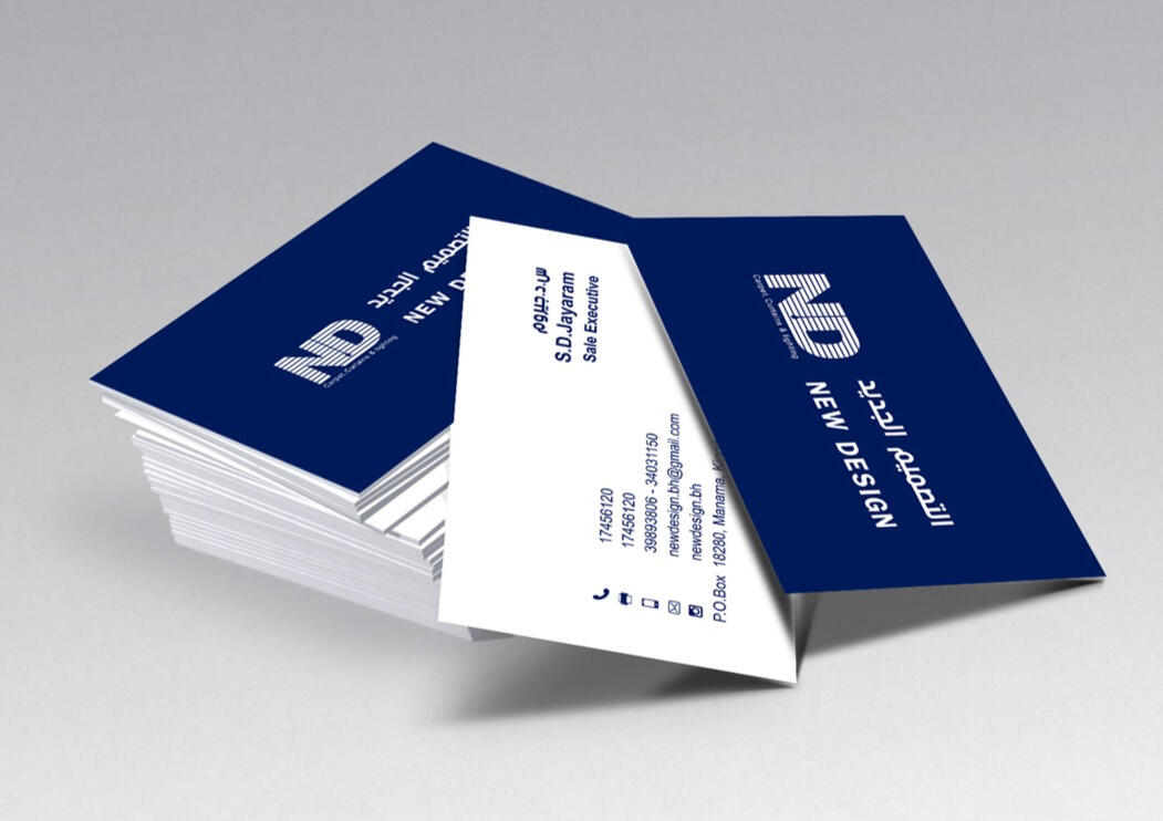
New Design
Objective: To create a logo and brand identity for a carpet and curtain shop that also supplies lighting appliances with the brand name "New Design".Solution: My goal is to help clients create an unforgettable brand identity that resonates with their audience. The logo is crafted using the initials of the brand. I wanted to ensure that the logo represented key aspects of the brand's profession, which is why I incorporated the blind curtain and tilt wand into the design. For the logotype, I used both Arabic and English typefaces in the same way on the right side of the logo. The colour is chosen based on the customer’s request.
SEE MORE PROJECTS

BVIS Branding
allDelivery Branding
ARTWORLD Branding
HelloHero Brand Collateral


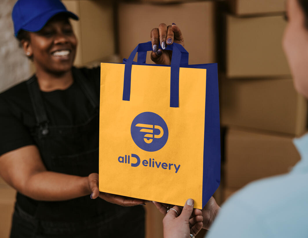
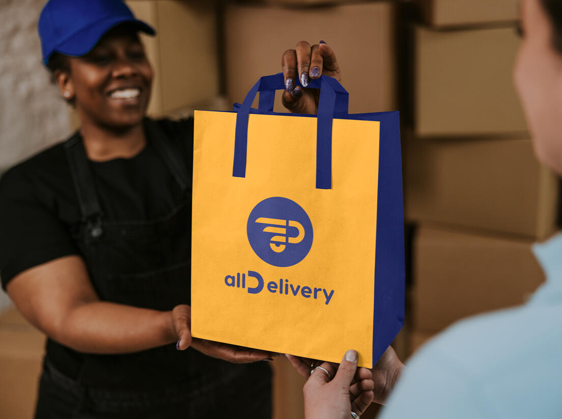
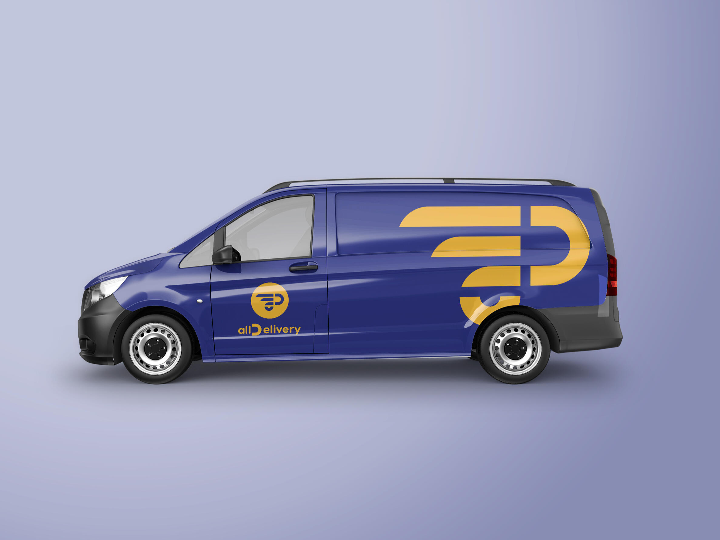
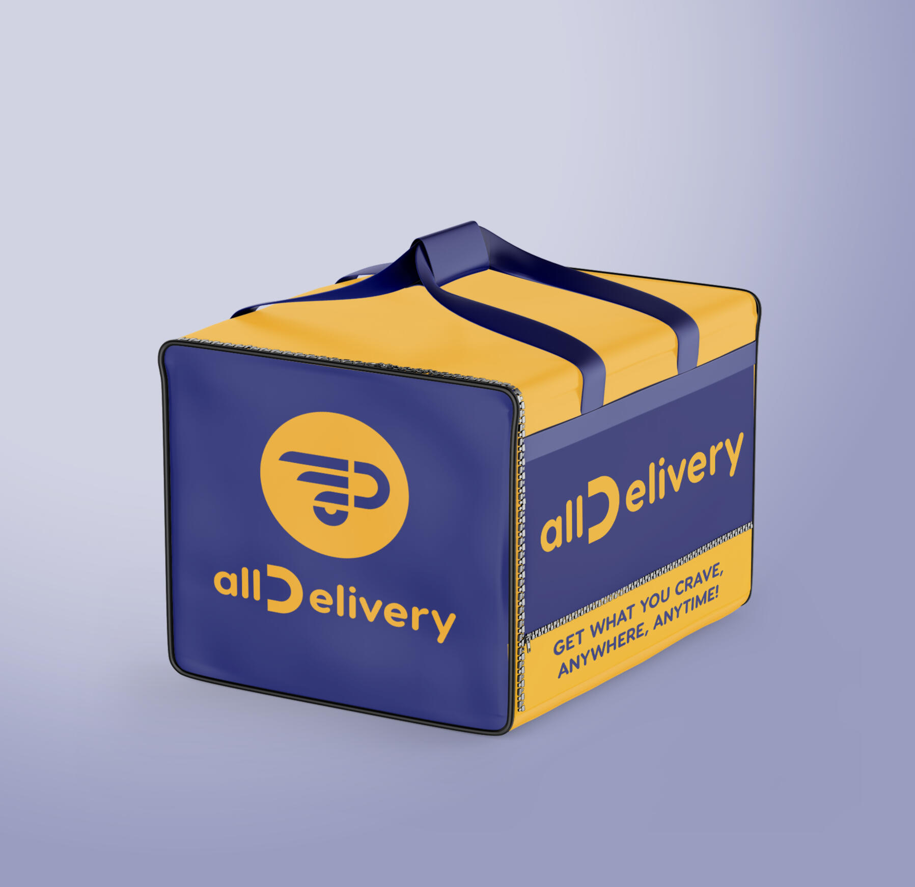
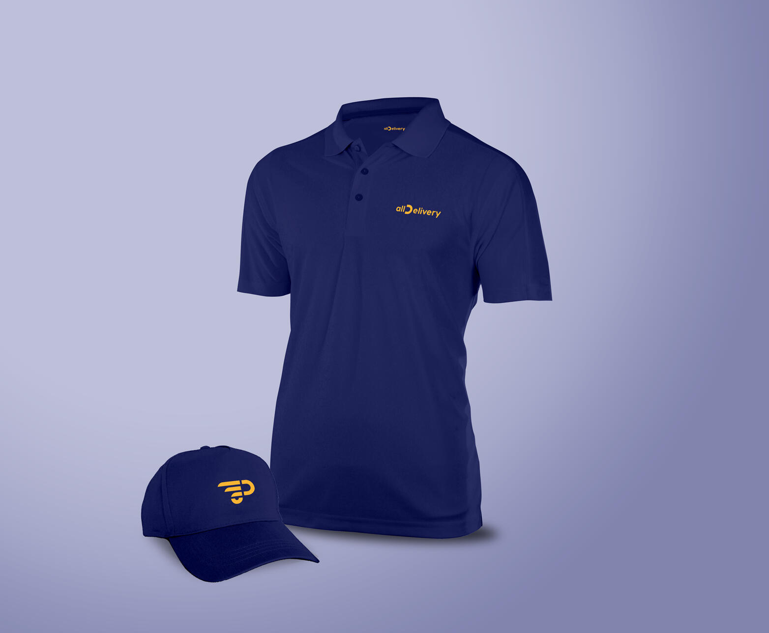
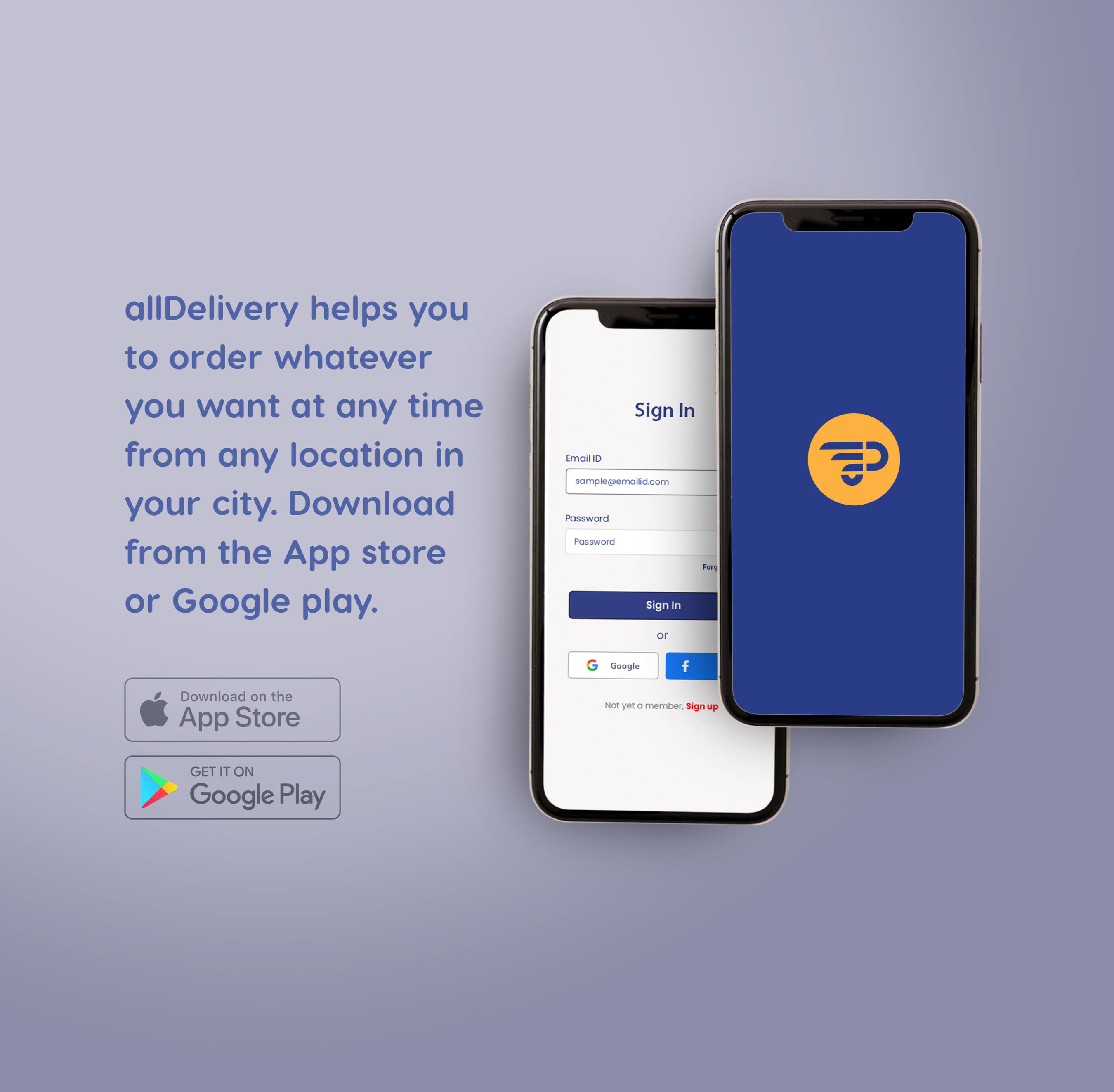
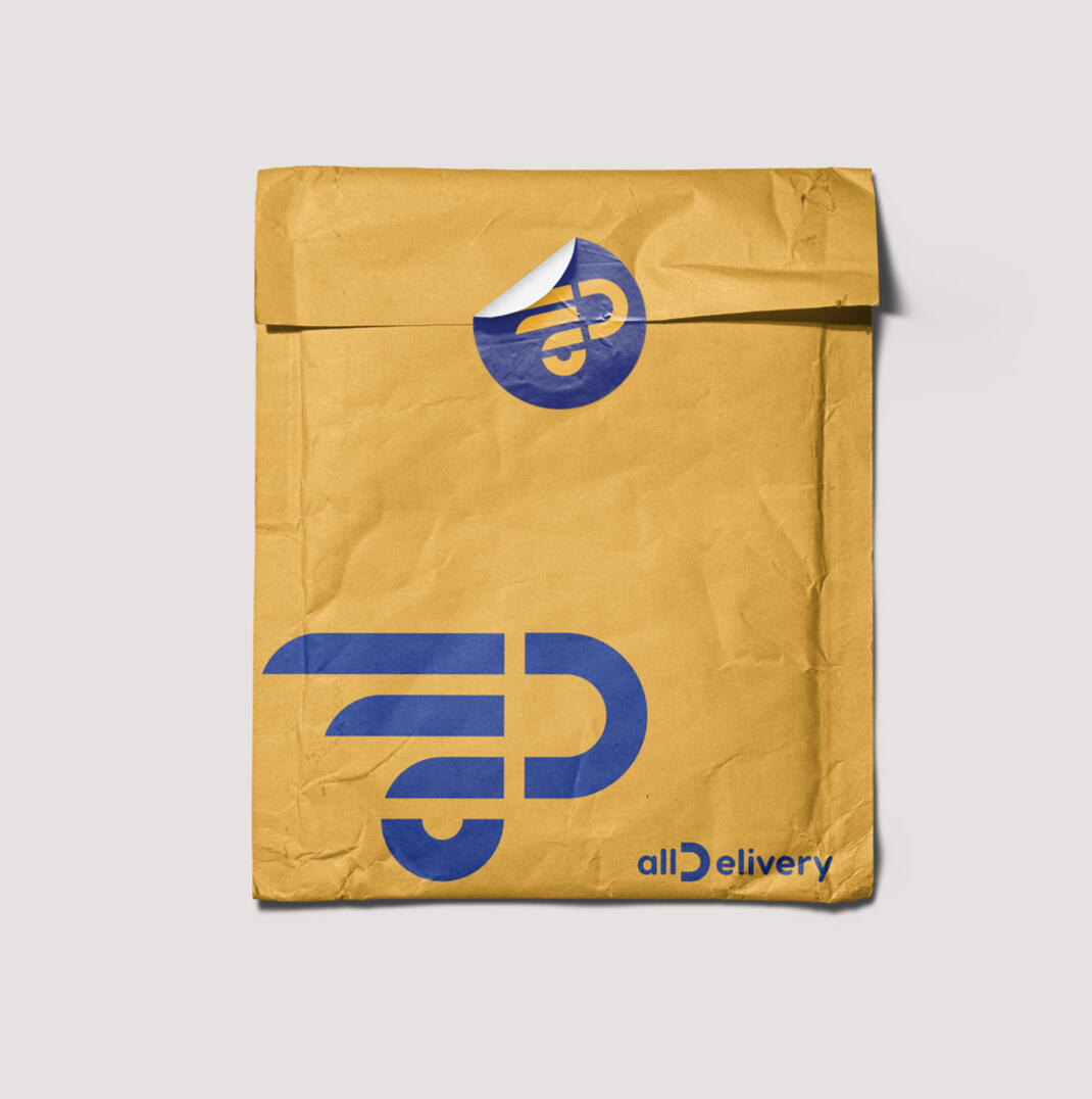
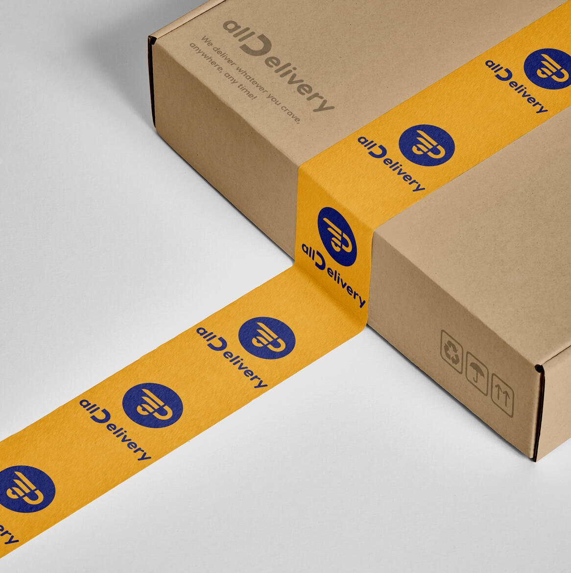
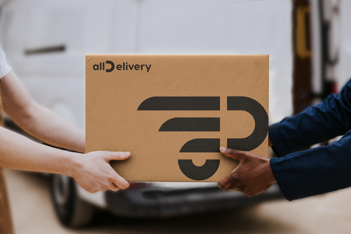
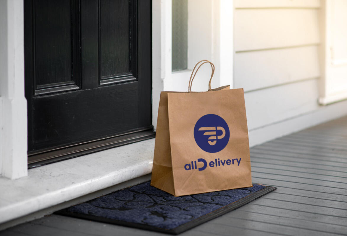
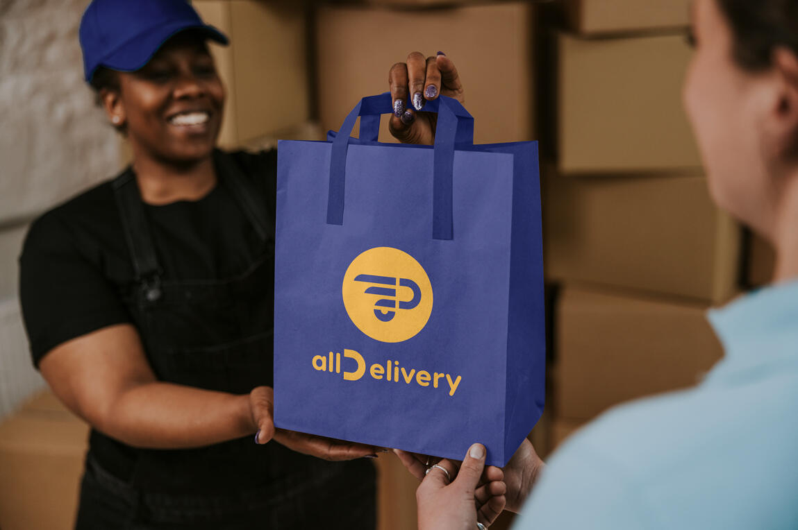
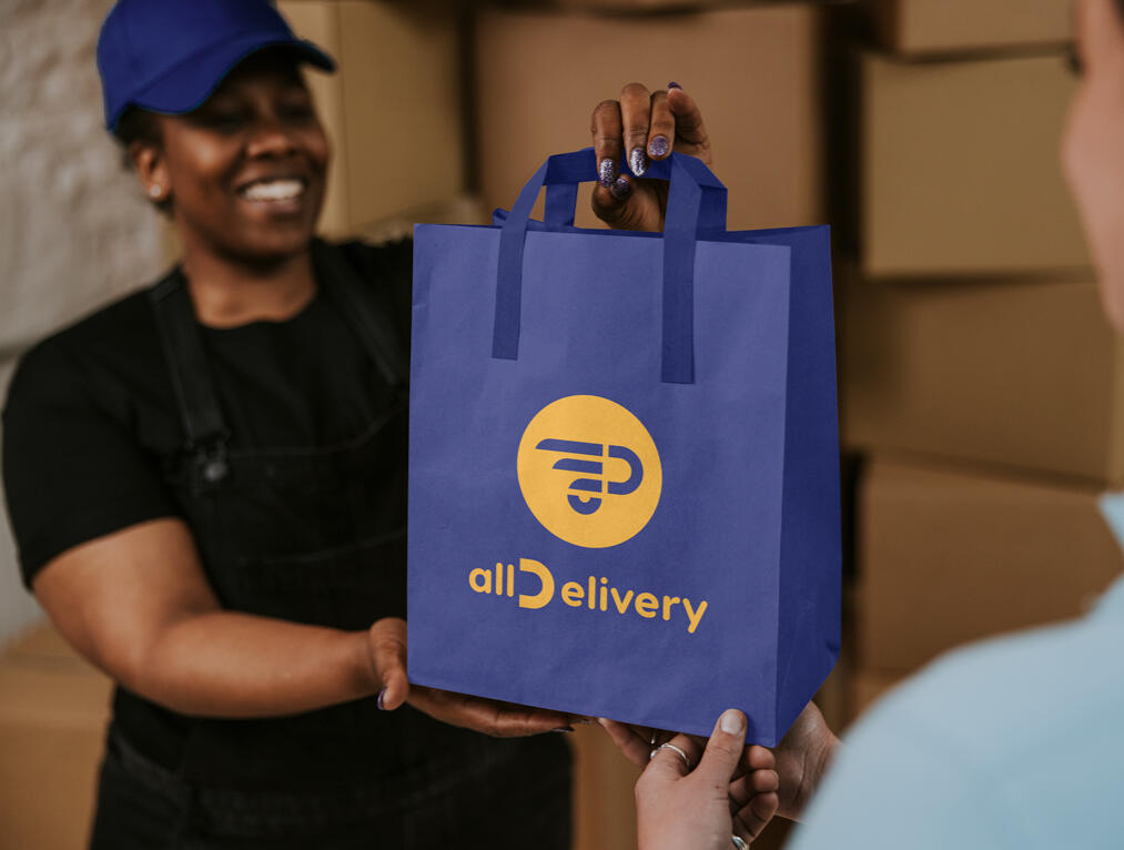
allDelivery
Objective: Creating a comprehensive brand identity for a US delivery company called allDelivery, to provide guidelines for employees when they are producing materials related to the brand. The mission is to provide delivery services, especially for restaurants, grocery stores, and more. Examples need to be provided about how the brand elements should be used through different channels of communication.Solution: The logo needed to address the mission of the brand. It has two components: the word mark and the symbol. The logo implies the shape of a vehicle and also displays the word "all" and the letter "D". The letter D is designed like a smile as an extra point. It conveys the brand’s mission, which is agile delivery for different purposes and customer satisfaction. The color palette conveys a sense of trust, energy, and positivity.
DIFFERENT OPTIONS FOR A VARIETY OF PURPOSES
SEE MORE PROJECTS
NEW DESIGN Branding

Alshagra Branding
ARTWORLD Branding
HelloHero Brand Collateral


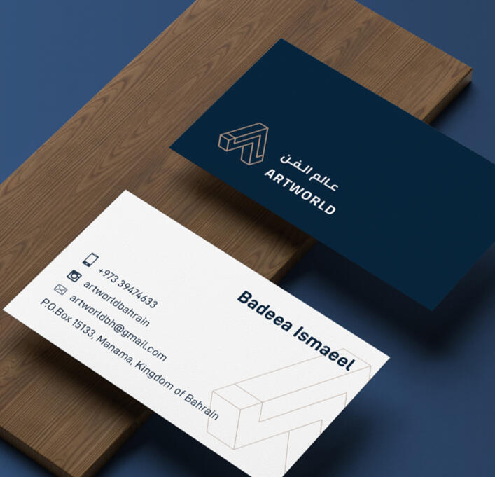
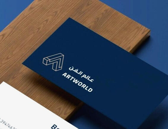
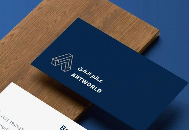
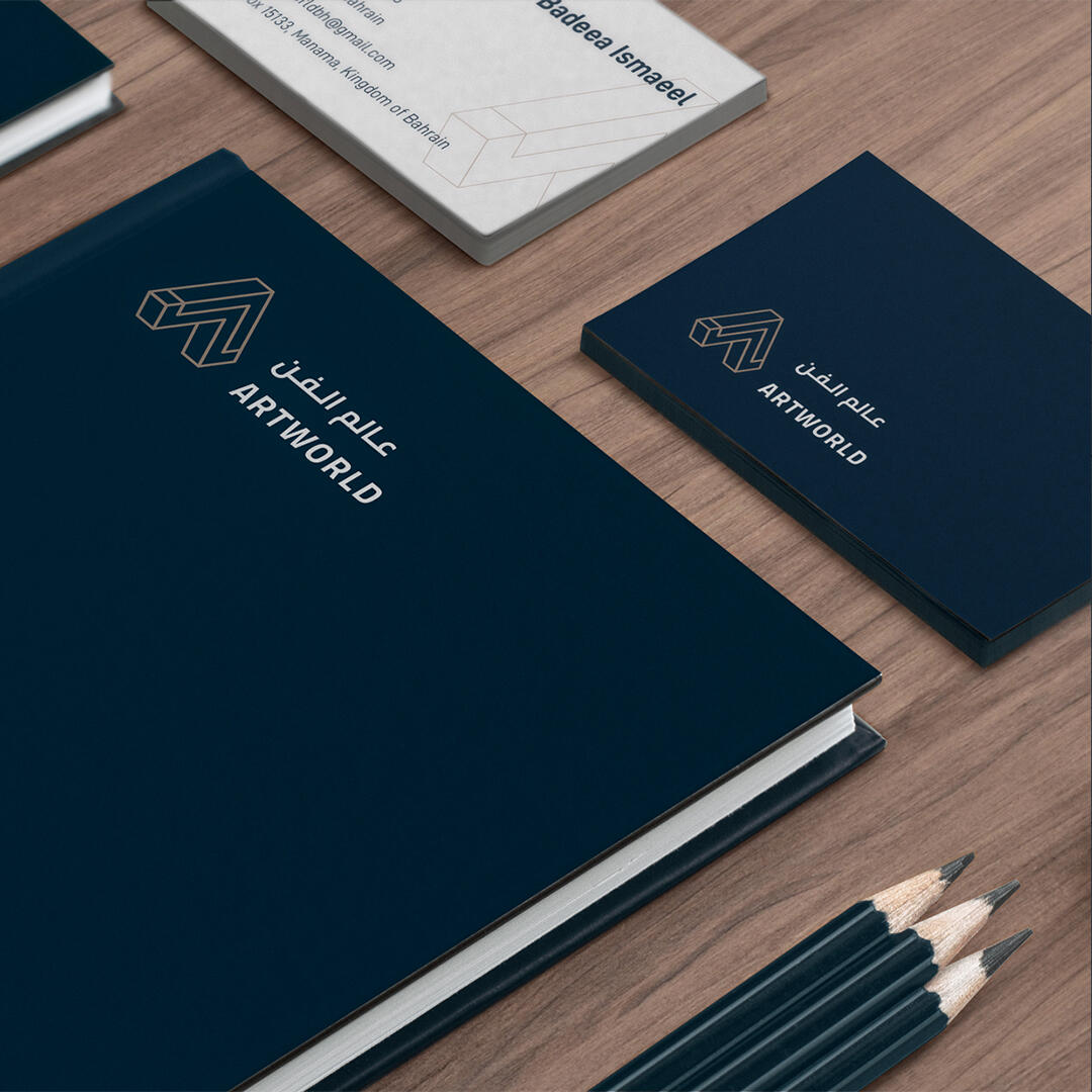
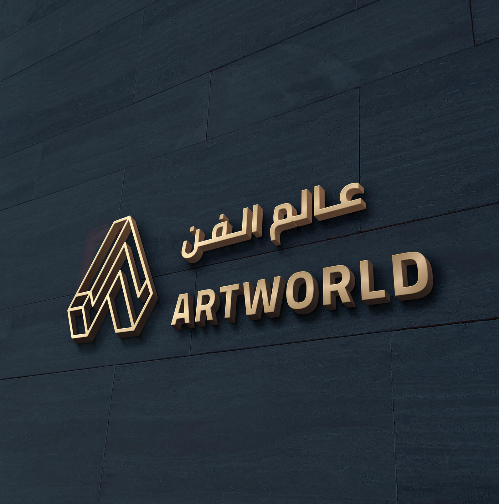
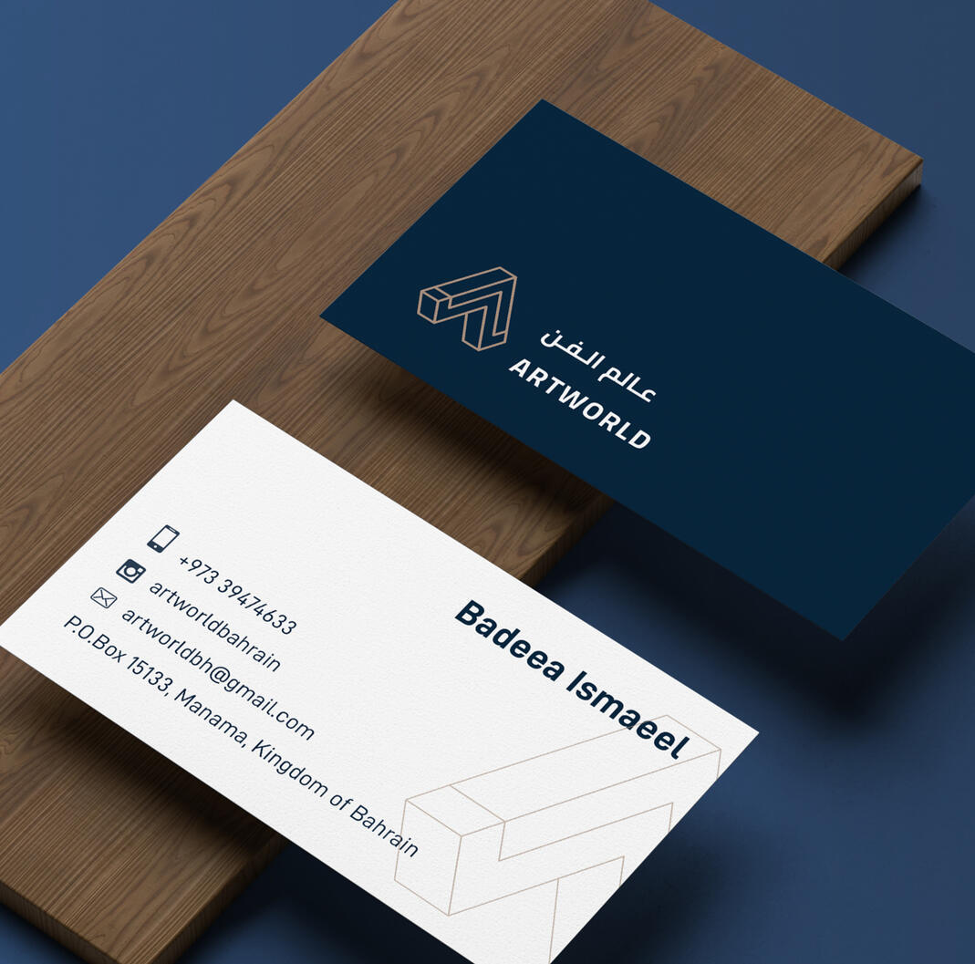
ARTWORLD
Objective: To create a brand identity for a new stablished high quality frame making store along with stationary.Solution:The brand name (logotype) is written as one word with capital letters to add extra emphasis to the logo. The letters A and W are designed to imply the shape of a frame and are tilted to give depth and a 3D effect. The Arabic typography style has been chosen to match the Latin typeface. Limited colors have been applied to convey the sense of contrast and elegance of the wood frame to the viewer.and positivity.
SEE MORE PROJECTS
NEW DESIGN Branding
Alshagra Branding

allDelivery Branding
HelloHero Brand Collateral

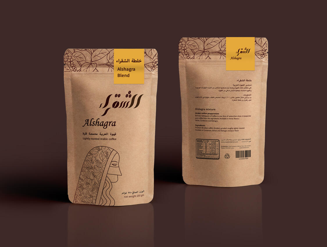


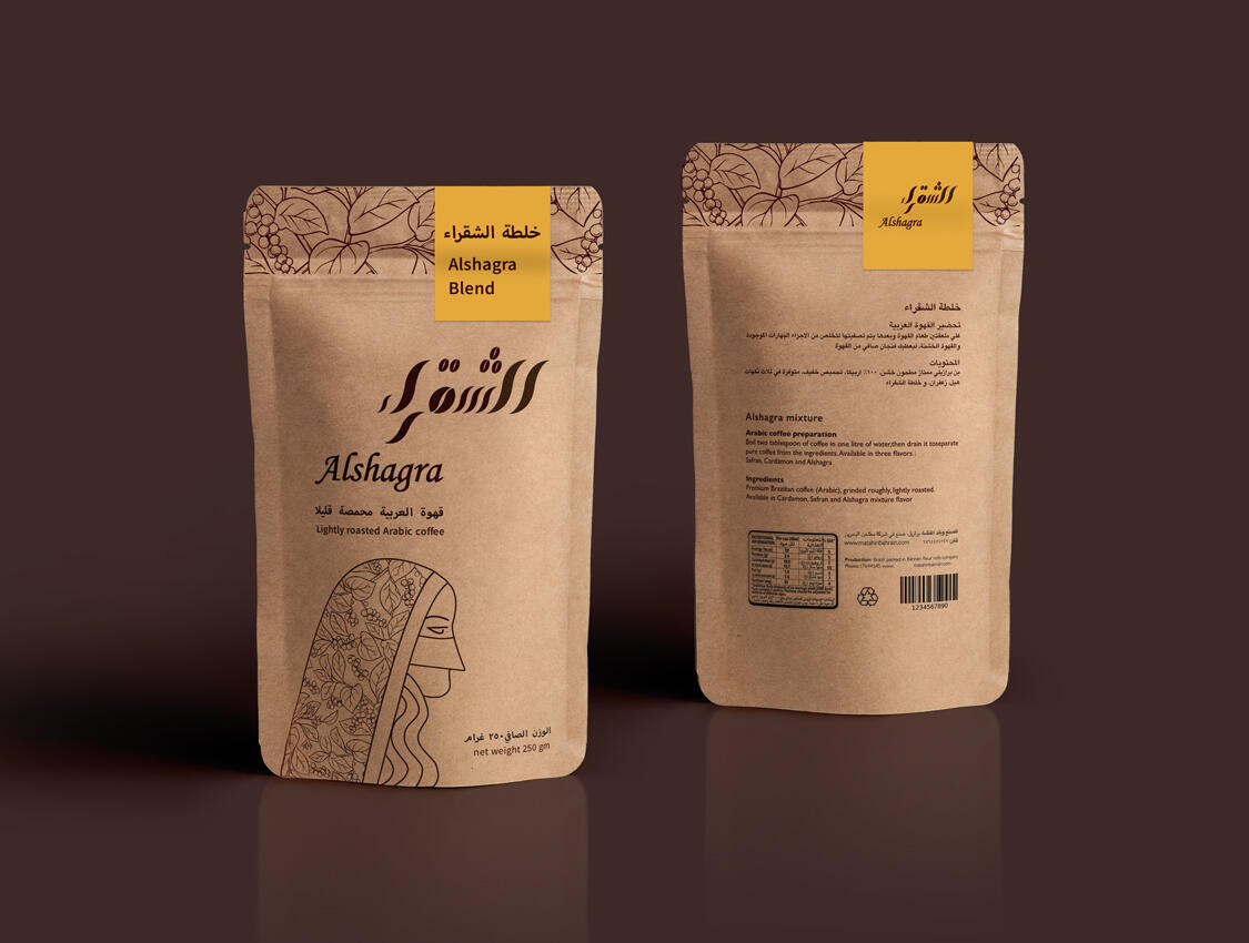
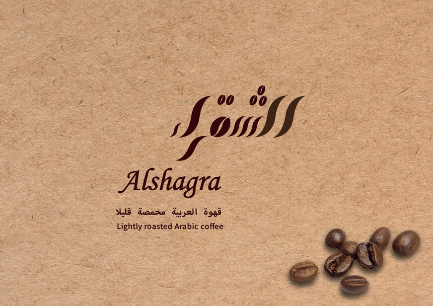
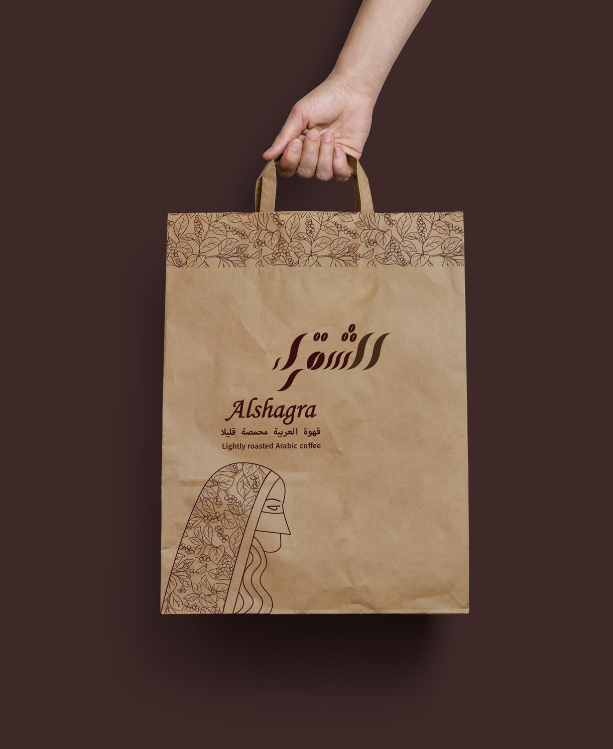
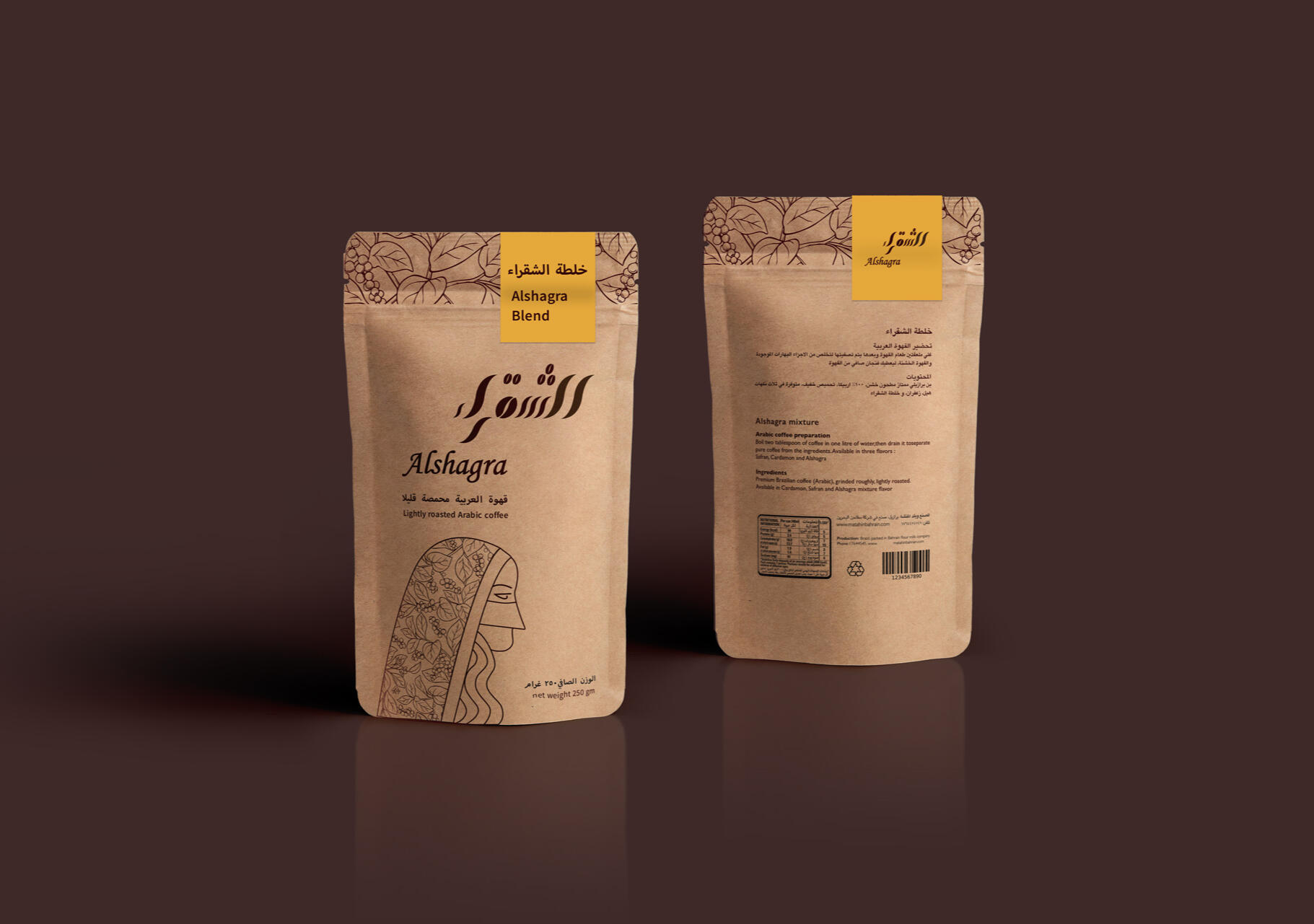
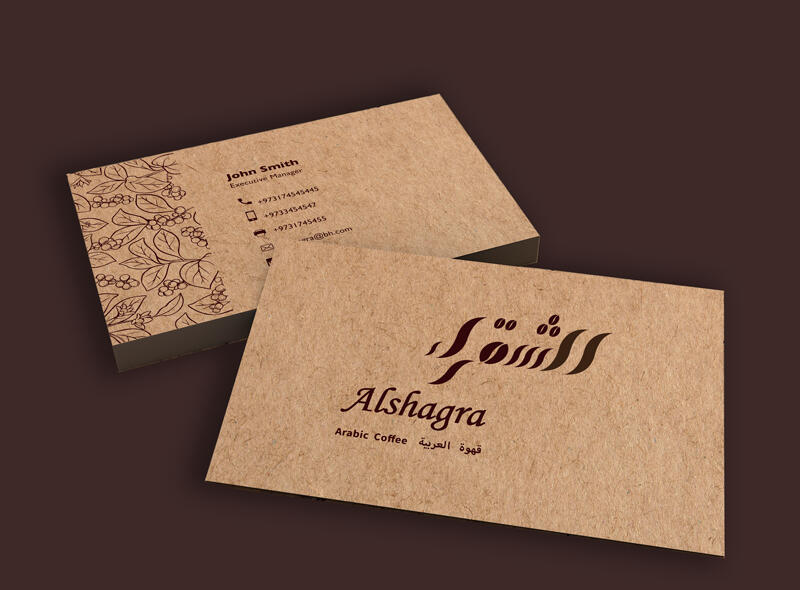
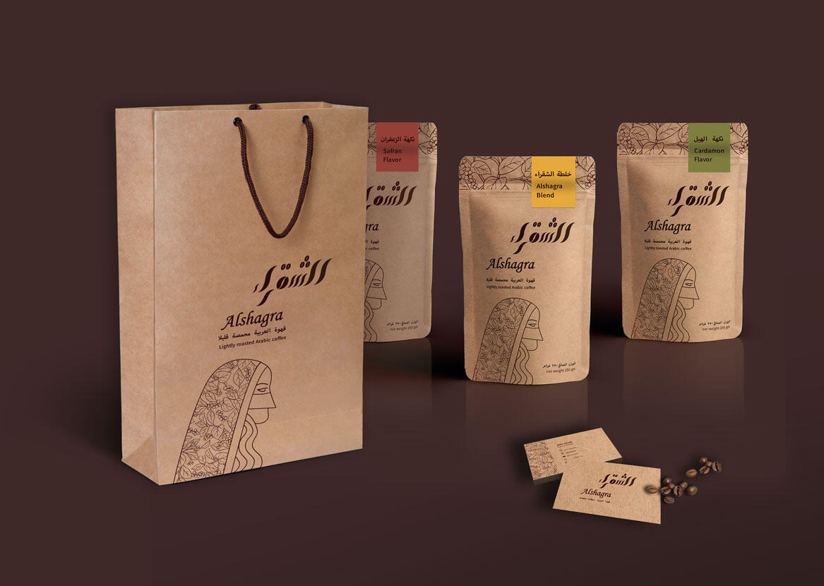
ALSHAGRA
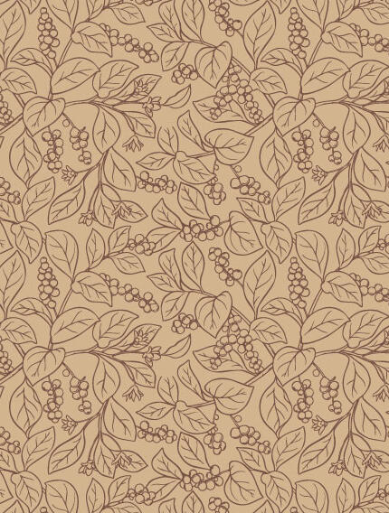
Objective: To create a sustainable package that can provide protection & durability to the coffee beens as long as facility to use. Target audience of this package are middle class people who regularly use Arabic coffee and appreciate the different flavors of the light roasted coffee been.Brand: The brand name means blond woman in Arabic, also it is a term that is used for light roasted Arabic coffee which is more pleasant. The logotype is inspired from the aroma of hot Arabic coffee.Pattern is inspired form coffee plant.The product comes in three flavors: Cardamon, Safran and Alshagra blend.
SEE MORE PROJECTS
NEW DESIGN Branding
HelloHero Brand Collateral

allDelivery Branding

ARTWORLD Branding


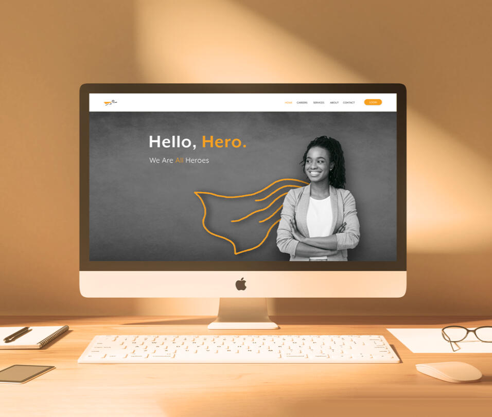
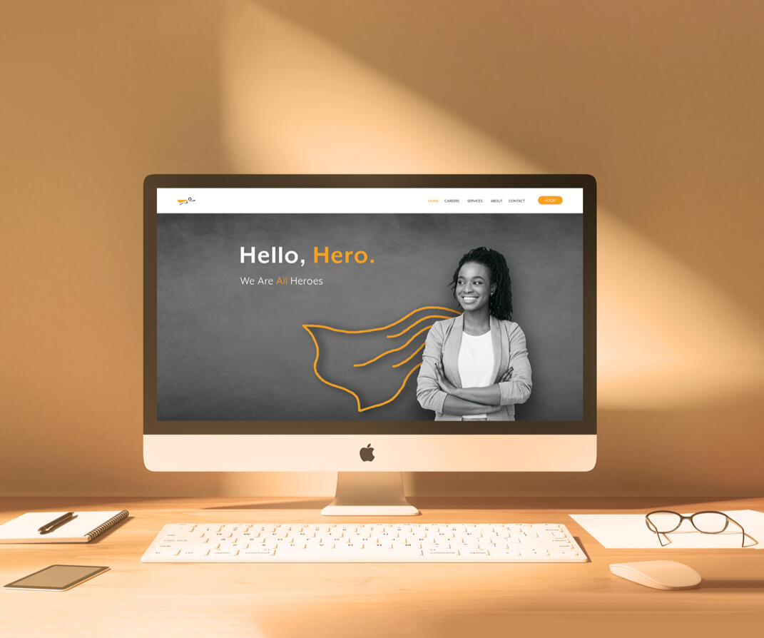
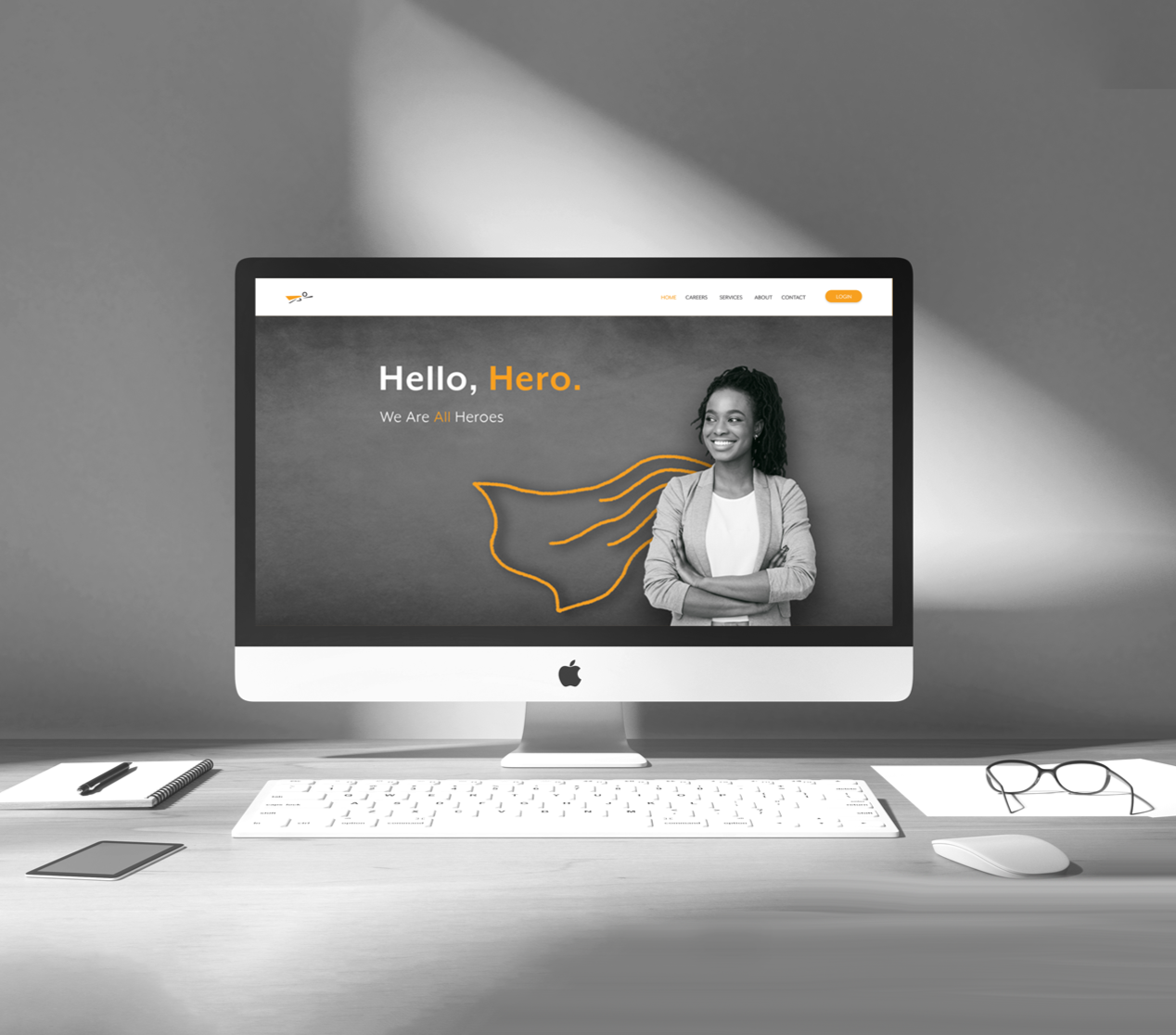
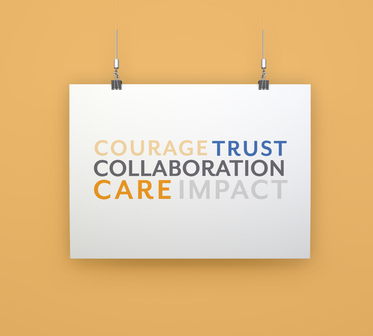
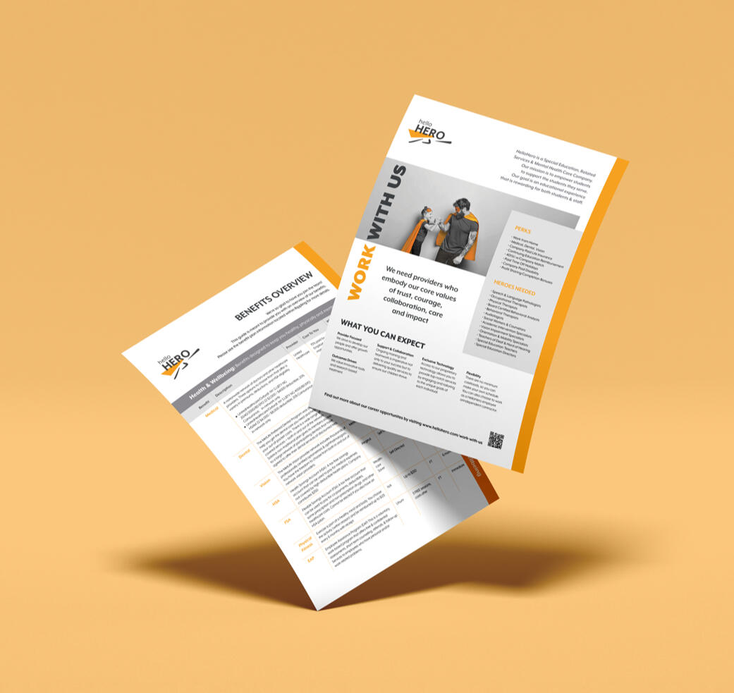
HelloHero
Objective: To cooperate for creating a set of collaterals for HelloHero brand, include designing and ideation for brand guideline book, brochure in form o postcards, animation, icons, illustration, typography, animation, and website design in order to provide guideline for employees, when they are producing materials related to this brand. Examples need to be provided about how the brand elements should be used through different channels of communication. In this Project RachelBerryStudio was creator of the logo and brand assets (colors and typeface choice), and I was as a junior graphic designer contributed to design the mentioned above after her approval.Solution: Due to brand mission which was providing online therapy and related services for schools and community, we decided to incorporate different parts of the US society in the design process. The brand color, typography, animation, and black and white shade in some places were considered to be applied in this big project.
A comprehensive 50-page brand book outlines the complete brand guidelines, providing clear direction for consistent brand application.

A comprehensive suite of icons and illustrations developed to ensure consistency with the brand's visual identity.
SEE MORE PROJECTS
NEW DESIGN Branding
allDelivery Branding

BVIS Branding
ARTWORLD Branding


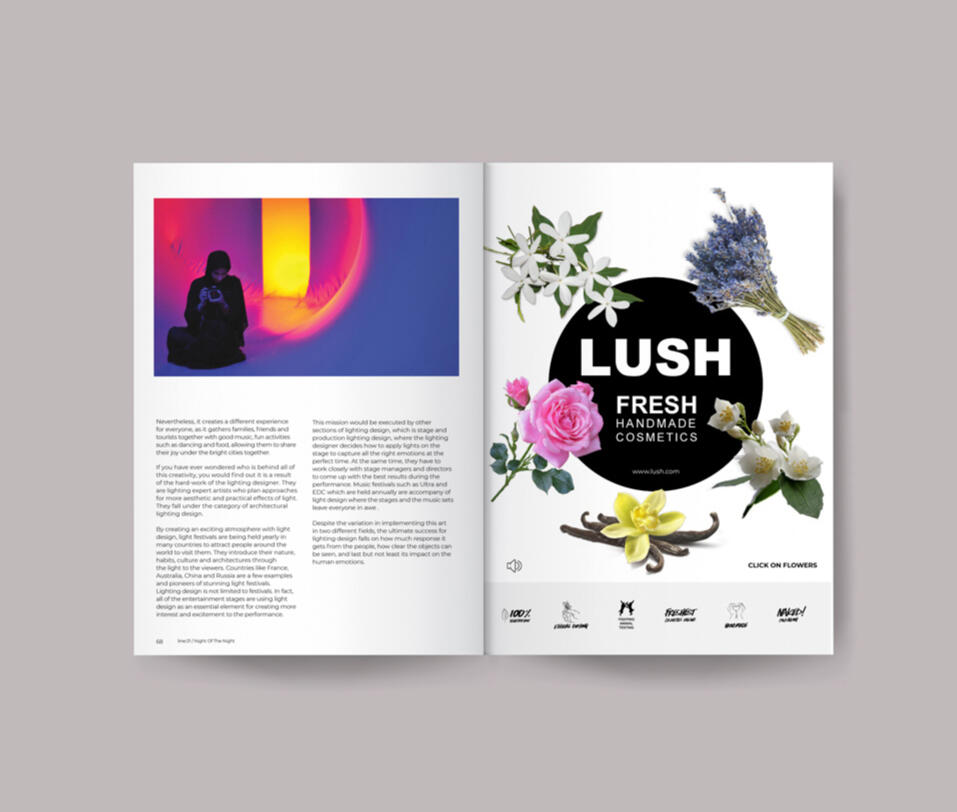
Line Magazine
Objective: A team work to create articles and advertisements for a brand new design magazine that is targeting designers. The mission is to demonstrate different aspects of design field locally and internationally. The articles should be designed for both printing and digital version.Solution: The articles that I have designed are focusing on the design fields in which not practiced in our region, such as designing for lighting festivals, design for colour blinds and visually impaired individuals, and an article about unequally employment between genders in design industry. Illustration of articles and photography have been done by me as well. The following slides display some of my works in line magazine. Digital version is designed by DPS.
Annual Report
Objective: To create an Annual report for Bahrain Polytechnic University as part of our assignment in a formal/young tone.Solution: To create this Annual report (formal tone) I applied my own design and photographs (team work & individual) along with the current information of this University. My design inspiration came from the mission and vision of this organization, which was training a new generation of students in order to develop and modernize kingdom of Bahrain.Red colour and its tint is chosen due to its association with Bahraini flag. Applied pattern represents this University.

HelloHero
ICONS
Objective: My objective is to create a set of icons for the HelloHero brand that capture the spirit of the company while providing a modern and recognizable visual aesthetic. The icons should be simple, yet meaningful, and should be able to be used on a variety of different platforms.Solution: The icons have been designed to be used on both digital and print platforms, meaning they must be easy to scale and adapt to different sizes. Additionally, I ensured that the icons are optimized for multiple resolutions, so that they look sharp in any environment. Finally, I used a variety of colors to create a unique and recognizable look for the HelloHero brand.
ILLUSTRATION
Objective: My objective of this project was to create a set of consistent illustrations that convey the Hellohero brand mission visually to their target audiences. This brand provide online mental health therapy, and related services to all US schools and academies.Solution: Illustration is an important part of any brand, helping to convey the brand message in an eye-catching and memorable way. At [HelloHro], I created illustrations that help to engage customers and communicate the brand’s identity. I use the brand’s color range and icons to create visual designs that accurately represent the brand’s voice.Last image in the slide is a photomontage representing the cape idea that I drew behind several characters. It demonstrates the Hero in each individual. this cape is animated in Aftereffect and has been displayed in HelloHero homepage.
Francesco's
PATTERN, ICON, TYPOGRAPHY
Objective: A cohesive collection of brand assets was developed for Francesco's, including custom icons, organic patterns, packaging graphics, and bilingual typography. The icon system was designed to create a distinctive and recognizable visual identity that can be consistently applied across menus, packaging, signage, and digital platforms. Organic patterns inspired by the brand's character were created to enrich the customer experience and strengthen brand recognition.Custom Latin and Arabic typography treatments were also developed in accordance with the client's requirements, ensuring a unified visual language across all touchpoints. Together, these elements provide Francesco's with a flexible and memorable brand system that enhances both functionality and aesthetic appeal.Solution: Based on client's request the icons designed to look organic , so designed it like hand drawn with the brand color palette. However, the illustration for packages look a bit different.
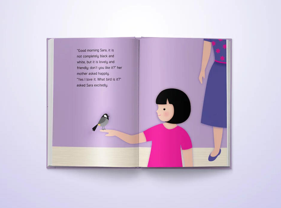
Story Book
Objective:To create an illustrated storybook for a selected age group, accompanied by an animated adaptation of the story using Adobe After Effects.Solution: For this project, I selected children aged 5–9 years as the target audience. The story was both written and illustrated by me, with all artwork created in Adobe Illustrator. The book was produced with a hardcover binding to provide a durable and professional finish.As a complementary piece, the illustrations were animated in Adobe After Effects, bringing the story to life through motion, sound effects, and narrated voice-over. The animation enhanced the storytelling experience while maintaining the visual style of the original book.
KINETIC TYPOGHRAPHY
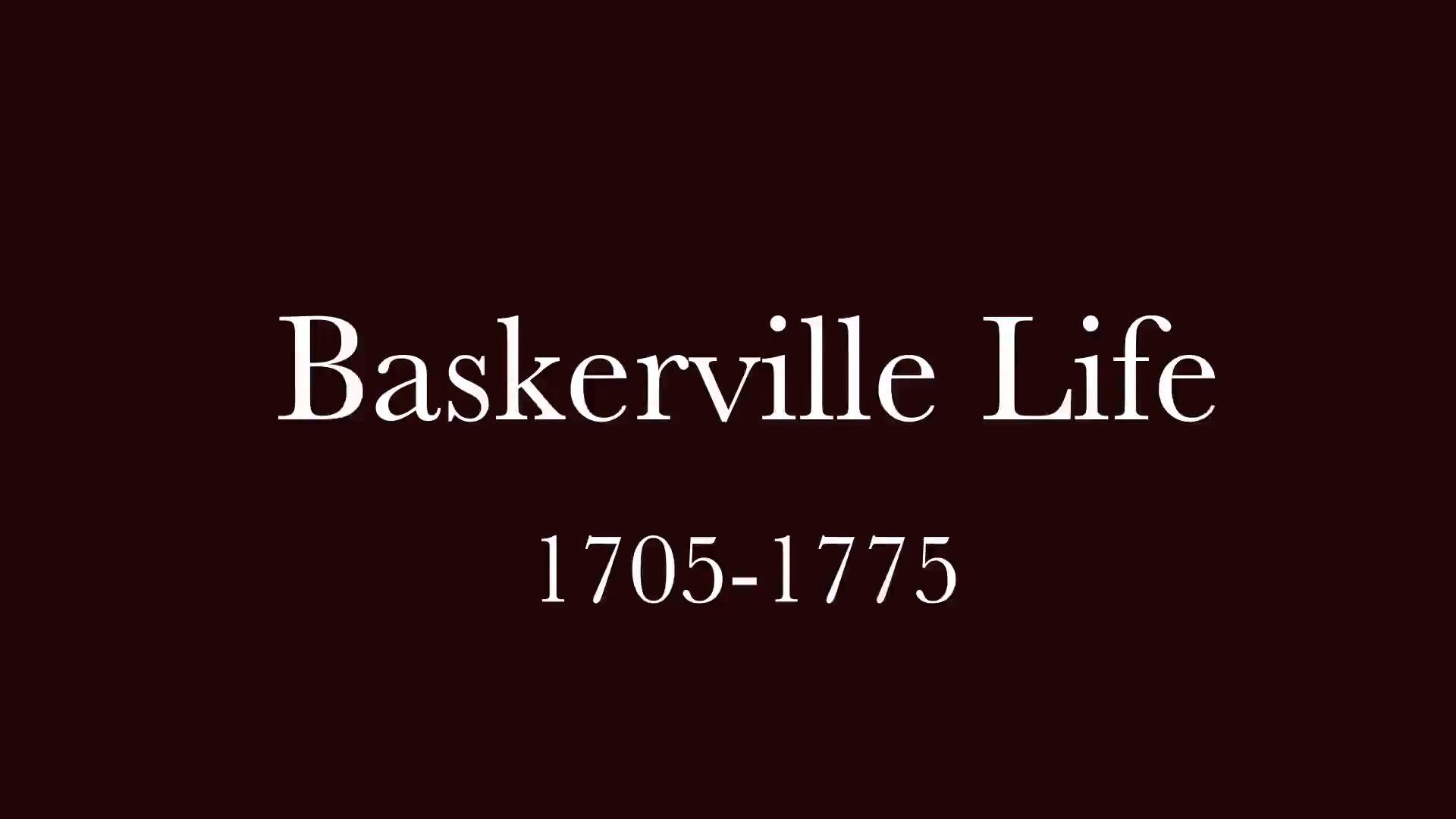
Objective: To design a motion graphic of our typography poster project, by only using the chosen typeface.Solution: Since my chosen type face was Baskerville, I decided to depict the founder's life story (John Baskerville) in which caused to create his own typeface through this short animation. There were three stages in his life which represented through posters (Advertising) and this kinetic typography movie. The choice of music was classical to be consistent with that period of time, and to be more harmonious with the movie. Designed in 2019.
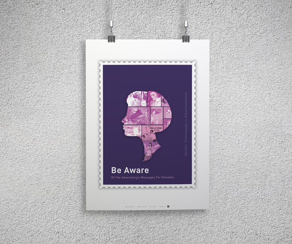
Gender Stereotypes
in Advertisements
Objective:This project is part of my final research project exploring the role of advertisements in shaping gender stereotypes in Bahrain. While gender representation in advertising has been widely discussed around the world, I aimed to investigate the presence and impact of this phenomenon within our local context.Through quantitative research conducted via a survey, the findings revealed that many participants have observed gender stereotypes in various advertisements. Based on these insights, I developed an awareness campaign consisting of two sets of triptych posters designed to highlight common stereotypes and encourage audiences to reflect on their influence.Solution:An awareness campaign was developed to challenge gender stereotypes in advertising through visual storytelling. Two sets of triptych posters were designed to encourage audiences to question traditional gender roles and recognize the impact of repeated media messages. The campaign was adapted across posters, billboards, social media, and short animated films to reach a wider audience.

ANIMATED POSTER
One f my articles in our magazine project was about designing for visually impaired individuals. For the digital version I made a poster with both normal font and braille font, then I animated it in After Effect. Due to displaying it in digital magazine the duration was short. The phrase was quoted by "Joanne Furio"who is one of the few blind architects in the world.


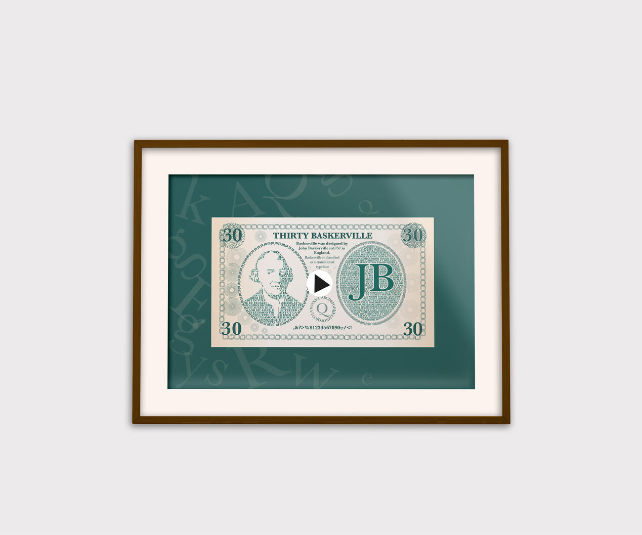
Typography Poster
Objective:To create a set of triptych posters that represent different weights and styles of a chosen typeface without applying shapes and forms.Solution: "Baskerville" was my chosen typeface. After I did my research about his life and his journey to create this type face, I chose this concept to depict this typeface. All the figures and shapes are created with different styles and weights of this beautiful typeface.The poster is animated in after effect as well.
Music event Poster
Objective:To create a set of triptych posters that recall for three different genre of musical concerts only by using letters. They include the Symphony of Beethoven, Jazz concert of Thelonius Monk and Arabic concert of Farid Al-Atrash Kahramana.Solution: After doing my research about the required types of music, songs and the composers, I designed my posters as following.
Gender stereotypes campaign
Objective:
This campaign was created to raise awareness of gender stereotypes commonly portrayed in advertisements. The project explores how visual communication and advertising can reinforce traditional perceptions of gender roles and aims to encourage a more balanced and inclusive representation of both males and females.Solution:
The campaign was developed through a series of triptych posters designed for outdoor billboards, Instagram, and a short awareness film. The visuals highlight common gender stereotypes found in advertisements and challenge these representations by presenting a different perspective. The color palette was carefully selected to reflect the idea of diversity and equality, with purple representing inclusivity and the balance between genders.One of the poster series was inspired by postage stamps, as stamps historically travel across borders and spread messages worldwide. This concept supported the campaign’s goal of spreading awareness beyond a single location. The visual style also referenced traditional British postage stamps, using their recognizable format and symbolic value to create a sense of importance and public communication. The short movies is designed in After Effect and is in motion design section.
Let's collaborate
Get in touch for inquiries and collaborations.
Thank you
Thank you for reaching out. I'll get back to you as soon as possible.